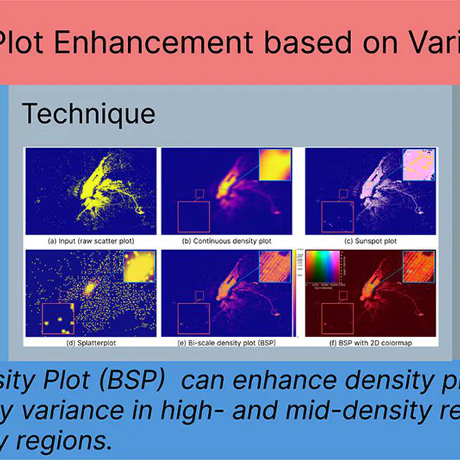
Results Different methods for visualizing the ‘New York TLC Trip’ data with two million points. (a) The scatterplot suffers from overdrawing; overlapping visual marks obscure the major structures. (b) A density plot using a Gaussian kernel reveals the global patterns, but the high density in the center (\ie Manhattan) hides peripheral local structures in the blue box, while outliers in the red box are missed. (c) The Sunspot plot better preserves the outliers but cannot reveal local density variations; see,~\eg the blue box. (d) Splatterplots abstract the density variations in high-density regions, hiding local structures, but show point samples in low-density regions; see the red box. (e) Our Bi-Scale density Plot (BSP) provides more details in low-density regions and reveals more underlying structures; and (f) The BSP enriched by our default 2D colormap, additionally allows looking up and comparing absolute density values and local density variations.
02-09-2025

Results Parameter analysis on the Hertzsprung-Russell diagram dataset [31]. (a,b,c,d) Increasing η makes low-density structures more salient while the high-density structures remain unchanged. (e,f,c,g,h) Decreasing φ makes low-density structures clearer, but at the same time darkens high-density structures.
02-01-2025